Sample report
Personal style report — Emma
Below is a full example of the personal style report Prova prepares. It runs to eight sections: from the colour season analysis through outfit recommendations and fabric guidance, to the layout of a recommended look, piece by piece.
This is a sample report. It was prepared for a fictional profile ("Emma"); your own report is personalised to your photo and your style preferences.
Report details
- Prepared for
- Emma K. — sample profile
- Report no.
- PR-2026-0418
- Input
- 1 full-length photo + 12-question style survey
- Result
- Soft Autumn · Modern Classic
- Sections
- 8
01
Your colour season
Soft Autumn
Your measured values — a warm-neutral undertone, mid depth and low saturation — place you in the Soft Autumn group of the twelve-season system. The value difference between your hair and your skin is small, so your natural contrast is low and colours suit you in their muted, dusty form. Judge a colour not by how bright it is, but by how soft it is.
Measured values
- Skin#D8B49B
- Hair#6F4E37
- Eyes#5D3E2F
Colour season plane
Light → Deep
02
The colour palette that suits you
| Colour | Hex | Name | Where to use it |
|---|---|---|---|
| #6F5742 | Cocoa | Coats, trousers, bags — your base neutral, standing in for black | |
| #A98860 | Caramel | Leather shoes and belts, suede jackets, knit cardigans | |
| #C9B189 | Wheat | Wide-leg trousers, trench coats, linen shirts | |
| #E3D6BC | Sand | Instead of white for shirts and base layers; your best light tone near the face | |
| #3E3A34 | Soft charcoal | The softened stand-in for black in evening wear | |
| #7D8355 | Olive | Knitwear, shirts, outerwear — your everyday accent | |
| #4F6152 | Sage | Sweaters and scarves near the face; it rests the skin | |
| #3B5563 | Teal | Instead of navy — shirts, blazers, a denim alternative | |
| #B06B4F | Terracotta | A warm accent in outerwear and accessories | |
| #8E4B46 | Brick rose | Your strongest tone for evening wear, lipstick and satin textures |
03
Colours to avoid
True black #000000
Far too hard against your low natural contrast. It sharpens your features and emphasises under-eye shadows and fine lines. Use cocoa or soft charcoal instead.
Optic / icy white #F6F8FF
Cold, with a blue break. Next to your warm undertone it pulls the skin yellow and makes it look drained. Use sand and cream tones instead.
Fuchsia / neon pink #FF2E9A
Its saturation overwhelms your low-chroma balance; people see the colour, not you. Use brick rose or dusty salmon instead.
Icy turquoise #66E4E4
Cold and bright. Placed beside warm skin, both end up looking artificial. Use teal or sage instead.
04
Accessories & metals
Yellow gold — matte and antiqued finishes
After the colour palette, your choice of metal is the second biggest influence on how your face reads. Your warm undertone makes yellow gold your natural partner, while bright white metals compete with the warmth of your skin. Finish matters as much as colour: high-shine, mirror-like metals create a hard point on a low-contrast face. Matte, brushed and antique surfaces sit far more comfortably.
| Topic | Recommendation |
|---|---|
| Primary metal | Yellow gold — especially matte, brushed and antiqued finishes |
| Secondary metal | Rose gold / bronze — warm and soft, ideal for everyday |
| Use sparingly | Silver — matte finishes only, and away from the face (belt buckles, bag hardware) |
| Avoid | Bright platinum, mirror-polished steel, icy white zirconia |
| Stones that suit you | Citrine, tiger's eye, coral, jade, smoky quartz, cream-champagne pearl, amber |
| Stones to avoid | Cold white diamond simulants, aquamarine, ice-blue topaz |
| Eyewear frames | Tortoiseshell, honey-brown acetate, thin matte gold metal |
| Leather tones | Cognac, tan, caramel — bags and shoes need not match exactly, only share the same warmth |
05
Outfit recommendations
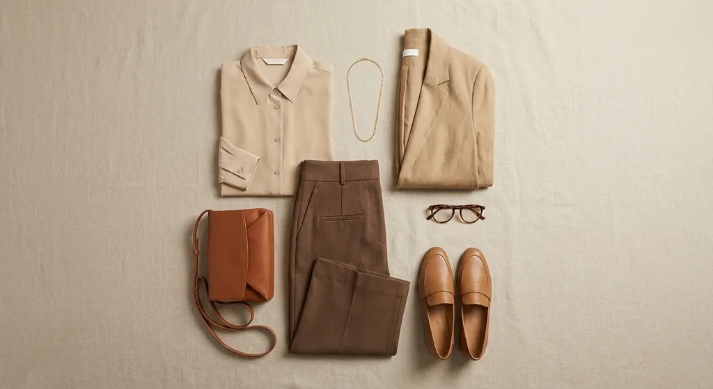
Outfit I — Office / meetings
Where
Work day, presentation, formal lunch
Pieces
- Top
- Sand silk-blend shirt, soft collar
- Bottom
- Cocoa wool wide-leg trousers, mid-to-high waist
- Layer
- Wheat unstructured blazer
- Shoes
- Caramel leather loafers, low heel
- Accessories
- Fine matte gold necklace, cognac leather bag, tortoiseshell glasses
Why it suits you
Built entirely from neutrals, this is a low-contrast tone-on-tone outfit. Because your natural contrast is low, this is exactly the kind of outfit that lets your face come forward.
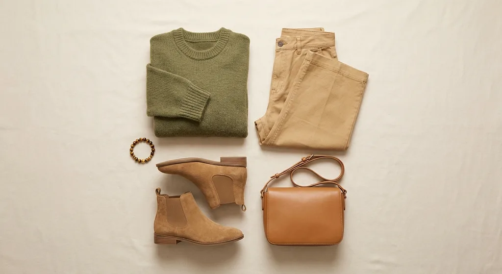
Outfit II — Weekend / casual
Where
Brunch, a walk, a daytime meet-up
Pieces
- Top
- Olive soft-knit sweater, slightly relaxed
- Bottom
- Wheat wide-leg cotton trousers
- Shoes
- Tan suede boots or cream trainers
- Accessories
- Tiger's eye bracelet, caramel leather shoulder bag
Why it suits you
The accent colour (olive) sits on the piece closest to your face. Keeping the bottom half a light neutral lengthens the silhouette and stops the outfit going heavy.
Outfit III — Dinner
Where
Restaurant, celebration, evening invitation
Pieces
- Dress
- Brick rose satin midi dress, dropped shoulder, fluid cut
- Shoes
- Soft charcoal suede heels
- Layer
- Cocoa fine-wool wrap or short cashmere cardigan
- Accessories
- Antique gold drop earrings, amber ring
Why it suits you
Swapping black for soft charcoal keeps the formality of an evening outfit while removing the hardness at your face. Satin is the only high-shine texture in your palette — which is why it stays on one piece.
Outfit IV — Travel / layered
Where
A flight, a city trip, transitional weather
Pieces
- Top
- Teal washed-cotton shirt
- Bottom
- Sand chinos or linen trousers
- Layer
- Terracotta lightweight trench
- Shoes
- Brown suede loafers
- Accessories
- Sage silk scarf, bronze watch
Why it suits you
In layered outfits, carrying the accent on the outer layer lets you keep the inner layer plain. Take the trench off and what remains is still a balanced outfit.
06
Fabric, cut & silhouette
Even with the colour right, the wrong fabric can undo an outfit. Your colour profile is low-contrast and soft; fabric and cut should follow suit. The general principle: fabric should absorb light, not reflect it. Matte textures support your low-saturation palette; glossy surfaces make a colour read more saturated than it is and break the balance. In cut, what we are after is "soft structure" — not entirely slouchy, but not stiffly lined with sharp shoulders either. An unstructured blazer is the clearest example of that balance.
| Topic | Recommendation |
|---|---|
| Fabrics that suit you | Suede, washed cotton, linen, matte wool, cashmere, raw silk, fine knit, chambray |
| Use sparingly | Satin and shiny silk — keep them to a single piece per outfit |
| Avoid | High-shine lamé, vinyl, stiff taffeta, glossy polyester |
| Shoulder & neckline | Soft, unstructured shoulder; V, gentle scoop or soft draped necklines |
| Waist | Mid-to-high waist; a light emphasis with a belt, not a corseted cinch |
| Silhouette | Straight or gently A-line; fluid lines that follow the body without clinging to it |
| Length | Midi (mid-calf) dresses and skirts; full-length or above-the-ankle trousers |
| Patterns | Tone-on-tone stripes, fine herringbone, faded autumn florals, batik and ombré transitions, animal print in brown-beige tones |
| Patterns to avoid | High-contrast black-and-white geometrics at scale, hard-edged graphic prints |
07
Your personal style direction
Modern Classic — Your twelve survey answers place you on the Modern Classic axis: you prefer timeless cuts, but in a current rather than a nostalgic reading. You tend to invest in long-lived, repeatedly wearable pieces rather than seasonal trends. This is consistent with your colour analysis. The Soft Autumn palette is calm and durable by nature; it lends itself to building a wardrobe that works together for years rather than chasing fast-moving trend colours. The practical consequence: a small number of well-cut pieces, in the right colours. You are better served deepening your wardrobe than widening it.
08
How the outfits are laid out
The closing section lays a recommended outfit out piece by piece — the garments themselves, seen flat — so you can read the proportions, the fabrics and the way the palette holds together before anything is bought.
The layout is not the report; it is the part that supports it. The value is in the seven sections above: the palette, the shades to avoid, the accessory and fabric guidance, the outfit construction. The layout makes them easier to picture.
Outfit III — Brick rose satin midi dress
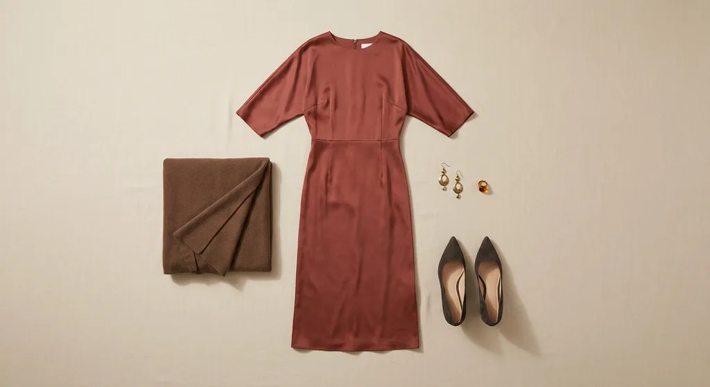
The layout is illustrative; it is not a guarantee of how an item will actually look or fit.
Your own report
Let's prepare your style report.
One photo, a few short questions. Your colour season, your palette, your outfit recommendations and your preview are waiting.